Google appears to be experimenting with a major visual refresh for the Gemini app on iOS, introducing a more dynamic interface with animations, cleaner layout, and simplified navigation. Early previews suggest the update is focused on making the app feel more modern and easier to use.
For now, the redesign seems limited to a small group of iPhone users, with no confirmed rollout timeline.
Also read: What is ChatGPT Images 2.0, and why are people talking about it
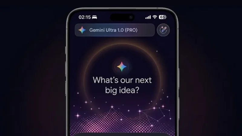
What the New Gemini Interface Looks Like
Based on early sightings, the updated design brings a noticeable shift in how the app feels.
- A subtle animated background sits behind the main input area
- The prompt field is centered, alongside the Gemini branding
- The interface reacts slightly as users interact, making it feel more responsive
This is a clear move away from static UI toward a more interactive experience.
A More Organized Way to Access Tools
One of the biggest functional changes could be how users access features.
A redesigned plus (+) button may now open a unified menu that includes:
- Image generation tools
- Camera input
- Music features
- Canvas and creative tools
- Deep research options
- File uploads
Instead of navigating multiple sections, everything could be accessible from one place.
Cleaner Visual Design and Better Readability
The redesign also focuses on improving clarity.
Expected improvements include:
- Softer color tones
- Semi-transparent layers
- Balanced spacing between elements
- Smoother transitions
On iOS, the app may also adopt a glass-like design style, giving it a more premium look.
Limited Availability for Now
It’s important to understand the current status:
- The redesign has only been spotted on iOS devices
- Even on iOS, only a few users are seeing it
- Android users do not have access yet
This suggests Google is testing the update before a wider release.
Why Google Is Redesigning Gemini
This update is not just about looks.
Google is likely aiming to:
- Improve usability and navigation
- Make the app feel more engaging
- Compete with other AI apps offering polished interfaces
A better UI can significantly impact how often users interact with the app.
Reality Check
A new design won’t fix everything.
- If performance is slow, UI won’t matter
- If features are confusing, design alone won’t help
- If updates are inconsistent across platforms, users will notice
So while the redesign looks promising, execution will be key.
Also read: Google May Introduce Ads in Gemini AI App as Monetization Plans Expand
Final Thoughts
The reported Gemini redesign on iOS shows Google moving toward a more modern and interactive AI experience. With animated visuals and simplified controls, the app could become easier and more enjoyable to use.
But until it rolls out widely, this remains an early test—not a finished product.